Monday, 18 April 2016

The Glasgow International Chronicles: Part I


This glorious visual arts festival occupies the entirety of the city, populating established art institutions to much smaller independent spaces. This is the seventh iteration of the festival that is open from 8th - 25th April 2016.

I was unable to spend as much time as I would have wished to properly devour and get a full taste of this contemporary art extravaganza. I think you need to devote at least a full day (if not two).

First I want to begin with the things I wish I had had chance to see, so that if you are going, you can see them for me: (If not you can just google them and look, and lament alongside me.)

  • Clara Ursitti - New Work. In various locations around the city until 23rd April 2016. She will be releasing different smells within the streets of Glasgow.
  • Birthe Jorgensen and Tawona Sithole - Bitter-Rose. On until 24th April 2016. This is a nomadic installation that moves thorough the city by foot. The show functions as an impromptu platform for discussion.
  • Nicolas Party - Mezzotint. Until 29th May. These prints and paintings begin with familiar objects and exaggerates their presence. Something that seemed worth a peek. 

But what did I actually go and see? I was fortunate enough to pack a variety of sights into my very short stay including exhibits and a play (sort of) at the following places:

  • The Citizen Theatre
  • Centre for Contemporary Arts
  • The Common Guild

Each place and artwork on display deserves its own post, so that is what shall be happening!

However, I do have space to mention the two smaller independent spaces I went to during my time in Glasgow. Both exhibitions. And both specifically on for the tight duration of the 18 days of the festival.

  • What? Concrete That Makes Us (Exhibition)
  • Who? André Komatsu
  • Where? Civic Room, Glasgow
  • When? Until Tuesday 26th April. Closed Mondays. Open from 12pm - 5pm.

I went there for one reason and one reason only. The tantalising photograph in your free Glasgow International guide that is available throughout the city.

(That and this is its first showing publicly since its exhibition in São Paulo in 2008. I'm a sucker for anything limited.)

The piece in question I want to focus on is called: Disseminação Concreta, made in 2006 out of gravel and clothes.

Having almost no context to base my thoughts on this piece, it just came from a gut reaction. Which in my eyes suits what it is you are seeing. Essentially, it is a stone person. Clothes and shoes have been placed and stuffed to resemble perhaps the most familiar shape recognisable to us: a human. The construction of the space means that as you circle the piece you are looking over what feels like a dead human being. It's a strange feeling as your brain understands that this is made of rocks, not flesh, but it's disconcerting silhouette says something else. It becomes unnerving, and yet at the same time peaceful. I wish I had had more time to stare but I had to scoot out. For fear of being late. (I was late.)

Last but not least:

  • What? The Vegetable Store (Exhibition)
  • Who? Erica Eyres and Garnet McMulloch
  • Where? Fireworks Studio
  • When? Until Monday 25th April. Open daily, Mon - Sat, 11am - 5.30pm and Sun, 12pm - 5pm.

This little display at Fireworks Studio was manned by a man and a dog when I appeared. News on the grape vine is that many fruits and vegetables had to be bought as subjects for these clay creations. The collection has fruits and vegetables in perfect aesthetic condition, with other produce appearing mouldy and last their sell-by date. (Garnished with little flies to boot.)

In all, I would recommend a visit to both of these exhibits in the programme. I would advise picking a few of them to make a crawl out of it.

Stay tuned for the remaining parts to this excellently titled series.

Friday, 25 March 2016

Review: Painting the Modern Garden (EXHIBITION)


It was a dreary morning when my mother and I rocked up to the Royal Academy (RA) with the hopes of seeing the new Impressionist exhibition tag lined 'Monet to Matisse' (something I have a slight problem with, but something I understand.) I'll place my note of warning here: book your tickets in advance. As we approached the building there was a queue. Now this wasn't necessarily a massive queue, but when the gallery is only releasing approx. 10 tickets per 30 mins and this means (as we had been informed) you would be facing a 2+  hour wait to get in, the length of the queue suddenly seems to triple in size. As we were on a tight schedule there was only one way around this problem: become a friend of the RA. Now the only reason we were (really) able to consider this is because I am a 16 - 25 year old human being. You can become a friend of the RA for £45 for the year (now upped to £50 - if in the age bracket.) What does this include? Immediate priority to you and a guest to the exhibition (any exhibition during that year, on multiple occasions if you choose.) If you sign up 'in-store' (as it were) you get a free tote bag, containing a copy of the quarterly magazine that you are now in receipt of (approx. £5 an issue.) You also get 10% off in the shop and something else to do with their cafes that I don't remember. In any case it worked out well for us as we were there for 1 day only and a single ticket to this exhibition is an eye-watering £17 (£10 if a student, but sadly not all of us fit this bracket anymore.) So, for time and monetary value it worked out well. (Also gives me an excuse to go and see this year's Summer Show to use my shiny new card.)

Now. Numbers and practicalities aside. (It is worth noting, that booking beforehand for this exhibition is highly recommended. This is something I seemed to have missed before.) The actual part that we are here to discuss: the exhibition itself.

I'll be quite honest. I wasn't expecting to like this show as much as I did. The exhibition brings together two very popular things (for a certain age group) together. Gardens and Impressionism. With the risk of sounding punny, this exhibition felt like a breath of fresh air - not in that it was showing us anything new, but that these paintings, with their glorious colour combinations, brought the outside in. Despite the drizzle outside, I could feel the sunshine inside. These paintings and artists so perfectly capture the beauty of nature and reiterate the importance of our green spaces. (Way to be relevant Leonardo Dicaprio.) 

These artworks give you the gift of seeing them twice. Once up close: the other far away. As Cher from Clueless so perfectly puts it 'she's a full-on Monet' a mess close up but alright from far away. As you look as close as the little rope will let you, you can gage a range of colours, placed with impassioned gestures that, from a distance, create beautiful blushing flora in colours that cannot be captured in reproductions. (I had to swallow my disappointment - firstly in the gift shop's postcard selection, but then in their poor imitation of such beautiful colour combinations. If Impressionists knew anything, it was their colour combinations.)

In terms of enjoying this particular exhibition (as let's be honest, you can see a variety of these types of paintings in different free institutions (the National Gallery being a fine example)) the atmosphere created really held true as negating the rooms. What I mean by this, is that despite being sold out and rather crowded, there was a lovely sense of calm that I feel only nature can bring. Placing the subject matter aside what the curators of the space ever so cleverly did was to avoid the white cube. There were no white walls in sight. None. Each room had been perfectly matched to colours that evoked a calming energy, but perhaps most importantly, complimented the paintings on display. Various shades of greens, blues and browns really displayed these pieces in their best light. To have placed them in a white cube would have gone against the purpose of the artwork. Aesthetically, it would have washed out the vibrant colours making something so natural and friendly feel too clinical and harsh. It somehow would have changed their meaning completely.

Something else that this exhibition did that I've not really seen successfully done before is integrate two rooms on the exhibition route that didn't house any Impressionist paintings. One contained letters from the artists, botanical books that were inspirations, as well as a collection of Japanese prints that belonged to Monet. The layout of this room was intelligent as its main structure to house these documents was a mini green house that framed the room by being placed in the corners. The green house structure also stood as a centre piece to the room. (Each glass container holding what I guess to be plastic plants.) 

The other unusual room that offered the viewer a break was a room with photographs of each of the artists in their garden, along with a showreel with them in action. 

Another structural decision that worked really well was a room within a room. They had added a second bunch of walls inside one of the galleries, to add extra wall space to show more paintings. What I particularly enjoyed was that the outer walls were blue, and the inside structure was green. (To me this symbolises the water lily - something that inspired one of the most famous sons of Impressionism. *cough*Monet*cough*)

The final, and perhaps most important reason that sets this exhibition away from the rest is the end room. They saved the best until last. (And even use the most daring colour for the walls. (Deal teal.))

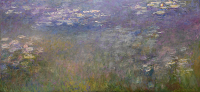
Agapanthus Triptych by Claude Monet (1916 - 1919)
(Small snippet of it below.)


This is a three piece painting that I've never seen the likes of before. The colours! The shapes! The three pieces reunited! This is the first time in over 60 years that these painting have been back together in Europe. In the 1950s Monet's family sold them, and the triptych was split up and sent to 3 separate institutions across the breadth of America. In my eyes it is a terrible pity. Almost to the point of destroying the work. (In fact, it does.) It's like separating twins at birth. 

These pieces are meant to be seen together. They are three thirds of a whole. Getting to see these in this exhibition is no doubt a once in a lifetime opportunity (unless you decide to visit multiple times.) There is something wistful about this work, something tranquil. It echoes stillness and contemplation. It really was worth the entire show.   

Below I've listed my other favourites. artists who I had not heard of before (who probably get passed over the more famous names (like Matisse. And although I do love him, he only had a small handful of paintings in this show that paled to others in comparison - hence my problem with the marketing.))

If you get a chance to go, keep an eye out for these. And if not - do Google them!
  • Frederic Bazille - Les Lauriers Roses (1867)
  • Gustave Caillebotte - Dahlias: the Gardens at Petit Gennevilliers (1893)
  • Gustave Caillebotte - Nasturtiums (1892)
  • Laurits Tuxen - Roses PS Kroyer (1893)
  • Laurits Tuxen - Rhododendron in Tuxen's Garden (1917)
  • Emil Nolde - Large Poppies (1908)
  • Kandinsky - Murano Garden II (1910)
This exhibition is open until 20th April 2016. If you can go, see it. If you do, remember, book in advance!

Sunday, 20 March 2016

Review: The Glass Menagerie (PLAY)


This is a very quick note to mention a very good play. The Glass Menagerie is currently playing at the Nottingham Playhouse in (you've guessed it) Nottingham. Ticket prices range from £10.50 to £28 - I managed to grab a ticket for £11.50 so it all depends on dates etc.

This play is the first by Tennessee Williams, highly autobiographical, and the start of his flurry of success. This four character play (some could argue five) runs for approximately 2 hours and 20 minutes (interval included.) The action (although quite quiet and domestic) allows you to be swept along in your seat, loosing the concept of time. In affect, this suits one of the strongest themes of the play: reality. We are brought in to a dream-like world; a world of the narrator's memory. This family life seems very sheltered, until broken by the arrival of someone from the outside. This all sounds very vague, but you'll get it if you see it, and get it if you've read it. The staging is great, it's quietly dramatic. The acting is fantastic. And it is something I would heartily recommend that you go and see!

On until Saturday 26th March 2016.

Wednesday, 9 March 2016

Review: Big Bang Data (EXHIBITION)


Open until 20th March - so there is still time to see! Tickets are £9.50 for students, £12.50 for adults.

Somerset House always do a great job at hosting exhibitions that would be difficult to imagine anywhere else. And Big Bang Data is no exception. If I had to describe what type of exhibition it is I would say this: it's an exhibition for people that don't like art.

Big Bang Data acts as a large umbrella to encompass anything and everything that deals with the theme. There are works from artists, designers and companies in a hot pot of responses to the digital world. A lot is very informative, visually stimulating and also (as is customary now) participatory.

The exhibition itself is really informative, helping to visualise data transfer and how much of it is stored and created everyday. Trying to place a weight on something invisible can really hurt your brain, but through different visuals (and lots of pretty colours) it seems much more understandable. One thing I have to say about this exhibition is that you will learn lots of facts. The type of facts you imagine people would use to impress people at dinner parties. For example:

'An incredible 90% of the data in the world today was created in the last two years alone.'

Go and impress your Uncle Bill with that one.

There were a couple of pieces that really interested me. So I'll briefly talk about those here. Firstly, 'Dear Data' by Giorgia Lupi and Stefanie Posavec (2014 - 2015). Loved it. In essence, the piece consists of postcards sent between two artists living on either side of the Atlantic. They measure a particular type of data relating to their lives that week, put the information on a postcard, and send it to each other via snail mail. This artistic transaction makes something invisible (data) into something tangible and something that we can grasp onto. Using an analogue system rather than a digital one, makes the concept of data far less intimidating and far more accessible for the audience to understand.

Secondly, (now this wasn't an art piece but more of an artefact) was the Rosetta Disk (2009). This is a digital archive of the world's languages. Some stats for you: it has over 13,000 pages of information in over 1,500 human languages. This blows my mind. And the actual disk is very tiny. It would fit into the palm of your hand, but somehow it is heavy with all this data. The disk has been purposefully made out of a durable material to last for thousands of years. The idea is that it will serve as a snapshot of the linguistic diversity of the world today. Imagine having a snapshot of the world's languages in something portable that would fit in your purse. Again, crazy!

The third piece that I want to draw your attention to is a work that I experienced first, and read about later. It's towards the end of the exhibition (and by this point, you might be experiencing 'museum legs') so when you see a cluster of black bean bag chairs, they look very inviting. Once sat down, you naturally look up, and above you (projected onto a concave screen) is what appears to be stars. Hundreds of stars that are slowly moving, exploding and shining on this projection. It is pretty beautiful, and rather mesmerising once you get stuck on those bean bags. (You may need a helping hand out of them.) Now, once I had finally struggled (both from fatigue and difficultly) to get up to drag myself over to the label, I was stunned to see that it wasn't purely a depiction of stars at all. It was a real-time representation of financial markets, driven by live trading data from the world's stock exchange. It was a demonstration of how beautiful data can be (and perhaps how deceptive it can be.) If you're wondering, this piece was entitled 'Black Shoals; Dark Matter' by Lise Autogena and Joshua Portway (2015).

There are so many other things that I could point out about this exhibition that I loved - the fact that you could 'sell' your data, see how much fossil fuel had been burnt during your lifetime, or even watching images to music that had been hacked from someone's personal computer.

The exhibition really finished on a high point, and brought the concept back to humanity. It is quite easy to get lost in logic and numbers, yet by educating us about data, this exhibition reminds us that we cannot rely upon this alone. We are reminded that our society can thrive on chance and disorder just as much data-centrism. Sometimes the answer isn't in the data, sometimes its through negotiation and debate, and within our heart. (As cheesy as that is, you know it's all true.) There must be room for opinions, mystery and chance.

The last piece you see as you leave the exhibition is called 'Data Will Help Us' by Jonathan Harris (2013) and it is a manifesto about the positive and negative possibilities of data-based logic. I will just leave you with a couple of lines from this piece, and also the opinion of that you should go to this exhibition if you can.

[About data.] It will help advertisers see people as statistics, but will it help us remember those statistics are people? It will help soldiers kill enemies remotely with drones, but will it help us see war as more than a game? It will help us live forever, but will it help us see that life's meaning stems from the fact that it ends? 

Sunday, 28 February 2016

Review: Austentatious (PLAY)


Austentatious: a fantastic, improvised Jane Austen novel. Something everyone should go and see. Something that you could see over and over again, as it is different every time.

As you enter the theatre, you are given a sheet to write out your own, none existent Austen title. Our party suggested the fine story: The Mystery of the Cuban Heel. Unfortunately, as Lady Fate would have it, Spas and Seduction was the story we were to see that night. And probably for the best. The actors are so clever, listen so attentively to each other and really deliver a fine comedic performance in the beautiful style of a classic Austen-esk tale. It had romance, drama and laughs. Modern day references were littered throughout, and amusing jokes were carried through. The company transport you to a different time by the power of their costumes and acting alone. I really can't rave about this show enough. You can find more information about the company and their concept here. They are currently towards the end of their UK Tour, but they perform more regularly in London at Leicester Square Theatre.

So if you can, go and find them along their horse-fuelled travels! (That's supposed to somehow to be a clever reference to the period Jane lived in. Please laugh.)

Sunday, 24 January 2016

Review: Until the Lions (DANCE)


I've never been to see contemporary dance before this. Never ever. And, I didn't choose to go, it just so happened that I was taken. Sometimes, (and I believe I had forgotten this) it's good to go and see something you might not have bought tickets for otherwise. Step outside what you know you do like for sure, and take some risks.

Until the Lions is the latest offering from the dancer and choreographer Akram Khan. Now, to people in the know about dance, this is a big deal, but me being me, this name meant nothing to me, which meant I sat down for the performance with no expectations. The show is currently on at the Round House in London. (And by currently, I mean, this evening is the last performance. So this information is very helpful for you. BUT it might actually be helpful, as if he does anything in the future near you, or this tours you might be inclined to see it, after I basically write in so many words that 'I like it'.)

The performance is a re-telling of a Sanskrit epic of ancient India, called Mahabharata. (Feel free to google it to understand the story. This was something I did after seeing the performance.) I don't want to talk about the story they told, or what it is about. I want to talk about the overall performance from the lighting to the singers.

The stage design was beautiful and ever so clever. It was the cross-section of a larger tree, with cracks that grew as the tension in the story grew larger and larger. The design of the stage plays an important role in the very end of the performance, with lighting and fog adding an extra level of theatrics. Now, although I thought this was of a pretty high standard, the sound was as good, if not better. It seems that Khan truly understands the necessity of collaborating with people who truly know their art forms. What I can say of Under the Lions is that it was a whole production. Everything worked as one, the dancing, the staging, the music. In particular I have to mention the female singer, named Sohini Alam who was fantastic. There are so many adjectives I could use, but I'll just stick with that one. Her musical projects are definitely worth searching and listening to.

All in all, if you have never thought about watching contemporary dance before, I would definitely give it a try. Hopefully, you'll enjoy it as much as I did. (I cried!)

Sunday, 17 January 2016

Review: Champagne Life (EXHIBITION)


A little quick note about Champagne Life the current exhibition at the Saatchi Gallery. Practical information first: the gift shop is great. It ends 9th March 2016. It is a completely female show with the works of 14 artists. One of the first of its kind. (Surprisingly perhaps? Something that I feel should have happened already, and possibly doesn't need as much hype as its received in terms of the gender of the artists, as at times, it can feel a little patronising.)

In any case, the overall exhibition was enjoyable, with a large mix of disciplines and a variety of practices on show. I'm not going to go into detail about the exhibition, except that it's worth a wonder around if you have a free afternoon. (This venue, as always is free - so you loose nothing.)

Before I go, just want to talk about the piece pictured above. This is a close up from Maha Malluh's work, (Untitled, Food for Thought Series) 2016. For me, this piece was above and beyond the rest. Visually, it is very striking and it's position in the gallery really led you into the room. Once you were in, and got to actually inspect what you were faced with, you saw that these were pots. 233 individual, used, cooking pots. Some were massive that could have fed a family of 10. Others were smaller, and perhaps fed 3. There's always something very powerful about experiencing something en masse. And here was no exception. The artist is from Saudi Arabia, and there was something that was really lovely about appropriating her culture into her work that wasn't overt or overtook the message. There's a lovely piece of maths that was written in an article by The Guardian which you can read here.

Rachel Cooke writes:

"In front of me were 233 such pots. If each one had once belonged to a family of five, who ate together perhaps once a day for a year, then this display represented the cooking of 425,225 meals – at which point these dented vessels seemed to take on the lustre of priceless objects."

There was something quite mesmerising about this work, that I'm finding quite hard to articulate (which is very helpful for you.) But, if you're unable to go and see the work yourself, then give it a google and have a stare. I think it's really worth a couple of moments of your time.