
It was a dreary morning when my mother and I rocked up to the Royal Academy (RA) with the hopes of seeing the new Impressionist exhibition tag lined 'Monet to Matisse' (something I have a slight problem with, but something I understand.) I'll place my note of warning here: book your tickets in advance. As we approached the building there was a queue. Now this wasn't necessarily a massive queue, but when the gallery is only releasing approx. 10 tickets per 30 mins and this means (as we had been informed) you would be facing a 2+ hour wait to get in, the length of the queue suddenly seems to triple in size. As we were on a tight schedule there was only one way around this problem: become a friend of the RA. Now the only reason we were (really) able to consider this is because I am a 16 - 25 year old human being. You can become a friend of the RA for £45 for the year (now upped to £50 - if in the age bracket.) What does this include? Immediate priority to you and a guest to the exhibition (any exhibition during that year, on multiple occasions if you choose.) If you sign up 'in-store' (as it were) you get a free tote bag, containing a copy of the quarterly magazine that you are now in receipt of (approx. £5 an issue.) You also get 10% off in the shop and something else to do with their cafes that I don't remember. In any case it worked out well for us as we were there for 1 day only and a single ticket to this exhibition is an eye-watering £17 (£10 if a student, but sadly not all of us fit this bracket anymore.) So, for time and monetary value it worked out well. (Also gives me an excuse to go and see this year's Summer Show to use my shiny new card.)
Now. Numbers and practicalities aside. (It is worth noting, that booking beforehand for this exhibition is highly recommended. This is something I seemed to have missed before.) The actual part that we are here to discuss: the exhibition itself.
I'll be quite honest. I wasn't expecting to like this show as much as I did. The exhibition brings together two very popular things (for a certain age group) together. Gardens and Impressionism. With the risk of sounding punny, this exhibition felt like a breath of fresh air - not in that it was showing us anything new, but that these paintings, with their glorious colour combinations, brought the outside in. Despite the drizzle outside, I could feel the sunshine inside. These paintings and artists so perfectly capture the beauty of nature and reiterate the importance of our green spaces. (Way to be relevant Leonardo Dicaprio.)
These artworks give you the gift of seeing them twice. Once up close: the other far away. As Cher from Clueless so perfectly puts it 'she's a full-on Monet' a mess close up but alright from far away. As you look as close as the little rope will let you, you can gage a range of colours, placed with impassioned gestures that, from a distance, create beautiful blushing flora in colours that cannot be captured in reproductions. (I had to swallow my disappointment - firstly in the gift shop's postcard selection, but then in their poor imitation of such beautiful colour combinations. If Impressionists knew anything, it was their colour combinations.)
In terms of enjoying this particular exhibition (as let's be honest, you can see a variety of these types of paintings in different free institutions (the National Gallery being a fine example)) the atmosphere created really held true as negating the rooms. What I mean by this, is that despite being sold out and rather crowded, there was a lovely sense of calm that I feel only nature can bring. Placing the subject matter aside what the curators of the space ever so cleverly did was to avoid the white cube. There were no white walls in sight. None. Each room had been perfectly matched to colours that evoked a calming energy, but perhaps most importantly, complimented the paintings on display. Various shades of greens, blues and browns really displayed these pieces in their best light. To have placed them in a white cube would have gone against the purpose of the artwork. Aesthetically, it would have washed out the vibrant colours making something so natural and friendly feel too clinical and harsh. It somehow would have changed their meaning completely.
Something else that this exhibition did that I've not really seen successfully done before is integrate two rooms on the exhibition route that didn't house any Impressionist paintings. One contained letters from the artists, botanical books that were inspirations, as well as a collection of Japanese prints that belonged to Monet. The layout of this room was intelligent as its main structure to house these documents was a mini green house that framed the room by being placed in the corners. The green house structure also stood as a centre piece to the room. (Each glass container holding what I guess to be plastic plants.)
The other unusual room that offered the viewer a break was a room with photographs of each of the artists in their garden, along with a showreel with them in action.
Another structural decision that worked really well was a room within a room. They had added a second bunch of walls inside one of the galleries, to add extra wall space to show more paintings. What I particularly enjoyed was that the outer walls were blue, and the inside structure was green. (To me this symbolises the water lily - something that inspired one of the most famous sons of Impressionism. *cough*Monet*cough*)
The final, and perhaps most important reason that sets this exhibition away from the rest is the end room. They saved the best until last. (And even use the most daring colour for the walls. (Deal teal.))
Agapanthus Triptych by Claude Monet (1916 - 1919)
(Small snippet of it below.)
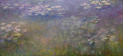
This is a three piece painting that I've never seen the likes of before. The colours! The shapes! The three pieces reunited! This is the first time in over 60 years that these painting have been back together in Europe. In the 1950s Monet's family sold them, and the triptych was split up and sent to 3 separate institutions across the breadth of America. In my eyes it is a terrible pity. Almost to the point of destroying the work. (In fact, it does.) It's like separating twins at birth.
These pieces are meant to be seen together. They are three thirds of a whole. Getting to see these in this exhibition is no doubt a once in a lifetime opportunity (unless you decide to visit multiple times.) There is something wistful about this work, something tranquil. It echoes stillness and contemplation. It really was worth the entire show.
Below I've listed my other favourites. artists who I had not heard of before (who probably get passed over the more famous names (like Matisse. And although I do love him, he only had a small handful of paintings in this show that paled to others in comparison - hence my problem with the marketing.))
If you get a chance to go, keep an eye out for these. And if not - do Google them!
- Frederic Bazille - Les Lauriers Roses (1867)
- Gustave Caillebotte - Dahlias: the Gardens at Petit Gennevilliers (1893)
- Gustave Caillebotte - Nasturtiums (1892)
- Laurits Tuxen - Roses PS Kroyer (1893)
- Laurits Tuxen - Rhododendron in Tuxen's Garden (1917)
- Emil Nolde - Large Poppies (1908)
- Kandinsky - Murano Garden II (1910)
This exhibition is open until 20th April 2016. If you can go, see it. If you do, remember, book in advance!
